How to make advanced color matching for home decoration? Refuse rustic matching
Color is one of the most strong elements
Because it can directly affect people’s emotions
And the expressive force of space
Therefore, in home soft furnishings
The selection and application of colors are particularly important
Let’s talk about home color matching in decoration today
Home color matching tips that you can easily master!

01
Color matching of the whole house
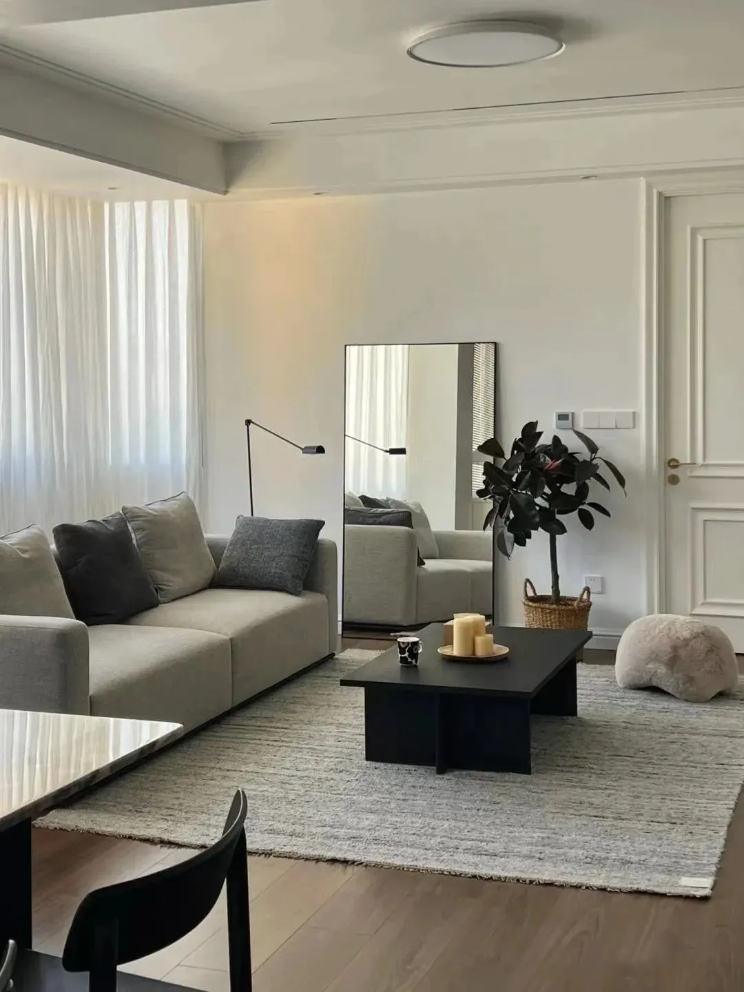
For small-area apartments, you can use cool colors, neutral colors and rising colors to produce contrast, so that the space is more transparent and larger. The warm color shows the warmth of the space and is more suitable for public areas such as living rooms and bedrooms.
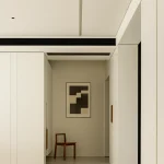
Neutral colors:Black, white and grey.
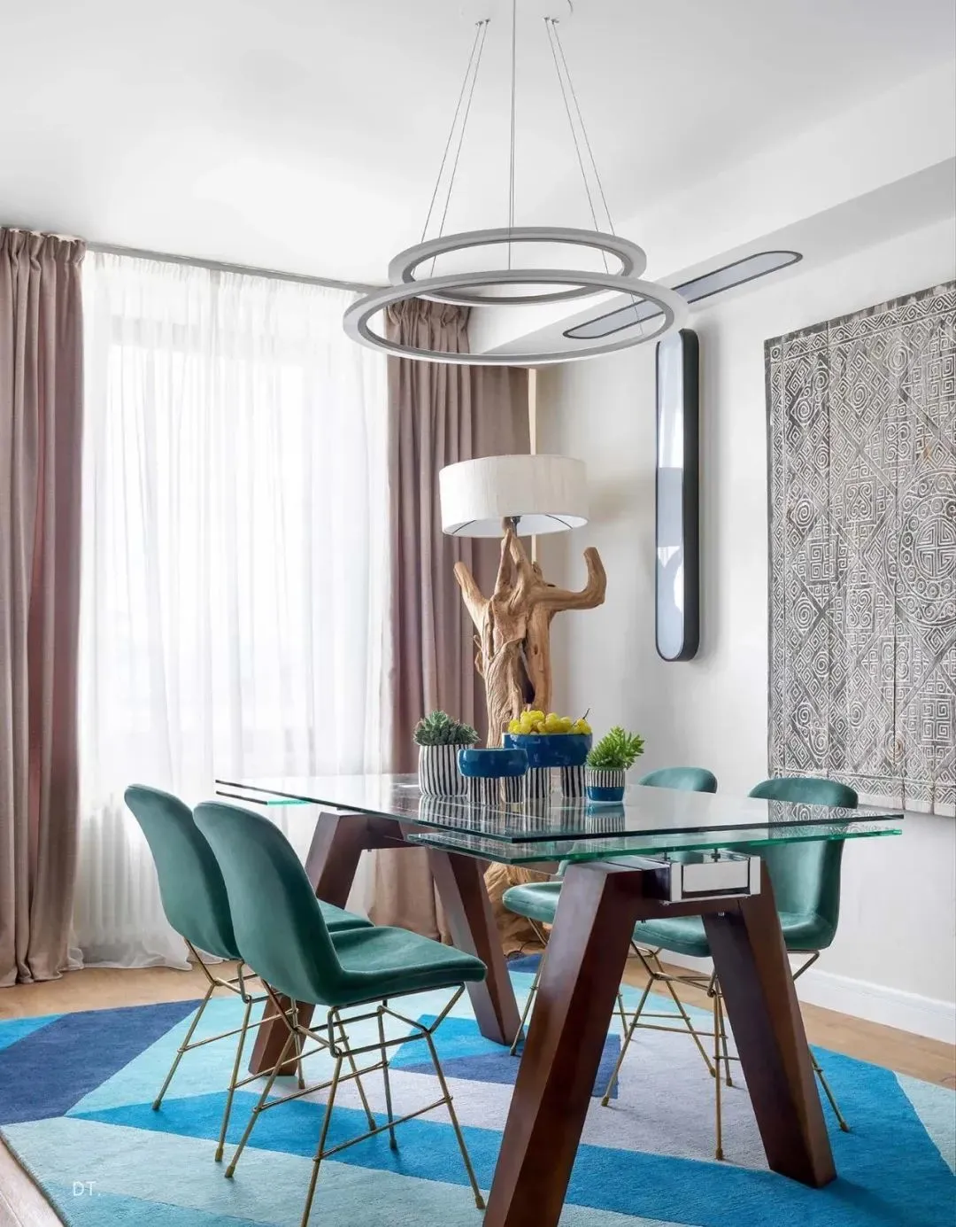
Cool color system:Blue, green, purple, etc., belong to later fading.
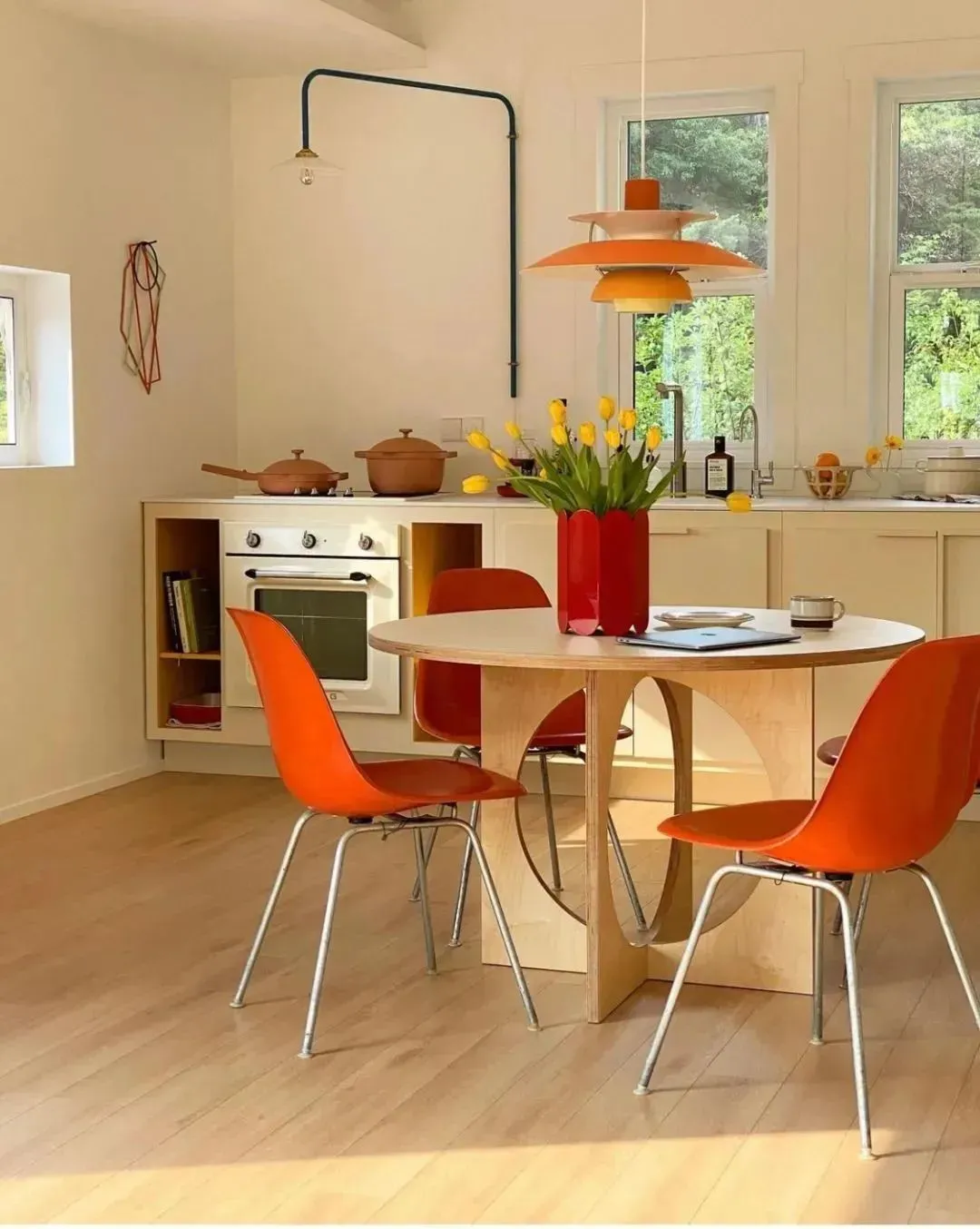
Warm color system:Red, yellow, orange, etc. are forward colors.
02
Whole house color matching proportion principle
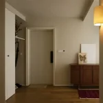
Space color, composed of basic color + theme color + embellishment color, color matching ratio:Background color: Theme color: Embellishment color = 7: 2: 1
Background color:Including floor, wall, ceiling, the tone of the whole home color matching.
Theme color:Including the colors of furniture and sofas, it makes the color scheme in the home richer, fuller and layered.
Embellishment color:It mainly includes soft decorations, hanging paintings, chandeliers, etc. to increase the sense of atmosphere and color-jumping embellishments.
03
Number and level of color schemes
Under normal circumstances, except black, white and gray, try not to exceed three other colors in the same space to avoid visual confusion.
The wall is deep in the ground, the furniture is deep:Dark sofa + log colored floor + white walls.
The ground is deep in the wall and the home is shallow:Light gray walls, gray tiles, white sofa.
04
Principles of color matching for soft furnishings
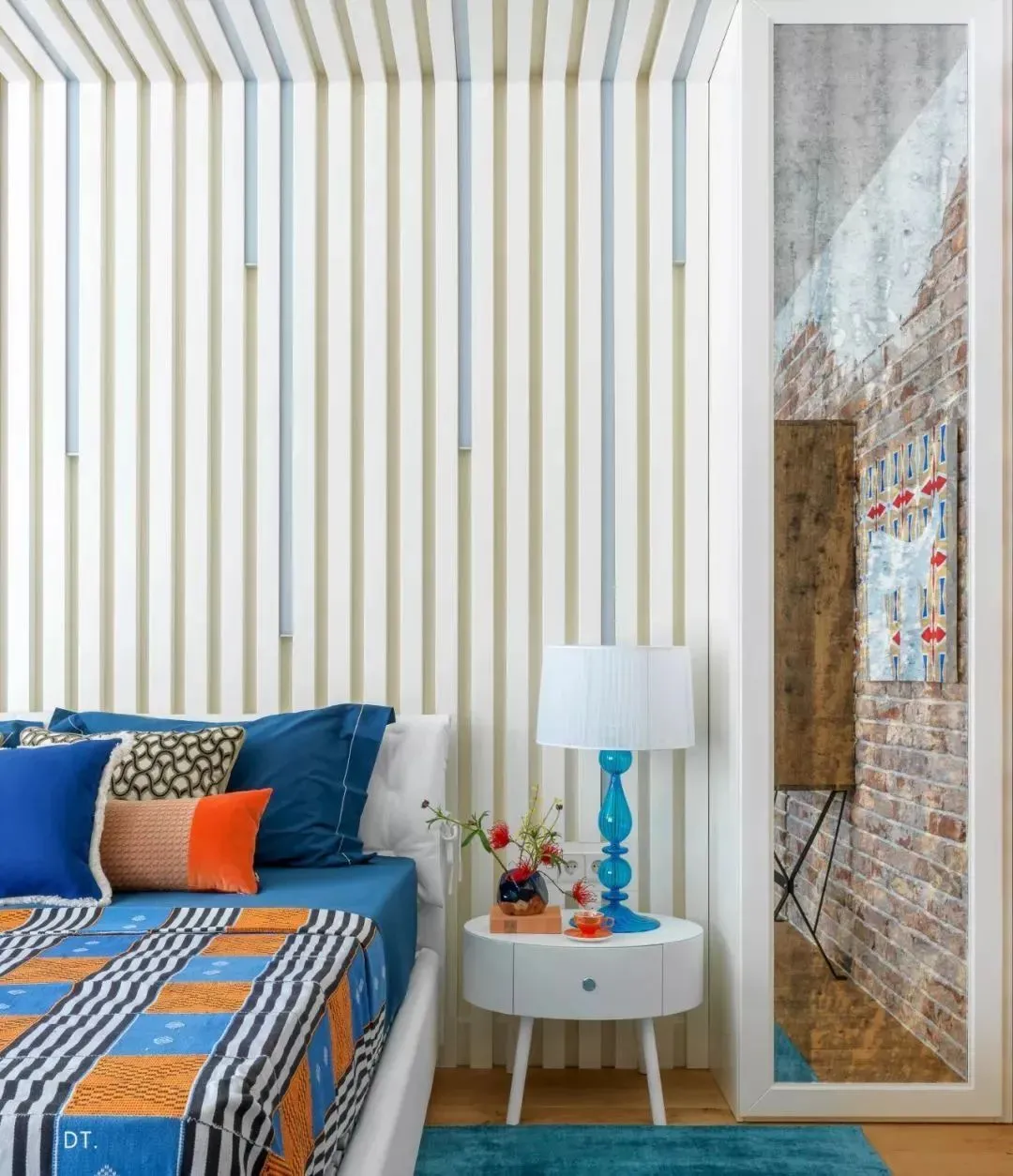
The more single the color, the richer the material:
Ordinary people’s home color matching, it is difficult to dress up with rich colors, and the professionalism requirements are too high. Then enrich your materials in the same color system, glossy, matte, woven, sherpa, textured, fur ball, leather can also be selected, and use rough texture or patterned fabric pillows and blankets to match them; Use the richness of materials to break the single color.
Deep and shallow should be alternated, and where there is deep, there is shallow:
If you want to avoid the integration of sofa and wall curtains and carpets, it is necessary to pull apart the chromatography in shades. Try to adjust all the photos to black, white and gray mode, and you will find that the photos with clearer black and white are more attractive and layered.
The color echoes and the degree of completion is higher:
Colors must echo, they do not exist in isolation; You can extend it to pillows and carpets, dining chairs and vases, even the colors of green plants, flowers and so on. Extract the colors and spread them out in the home space, and there will be unexpectedly beautiful results!